Data Viz Gallery
Data Viz Gallery
- Food Waste
- Media Concentration
- Football Match Reports/Dashboards
- The Death Toll of the Global Border Regime
- Interactive Line Chart – Historical Incomes by Region
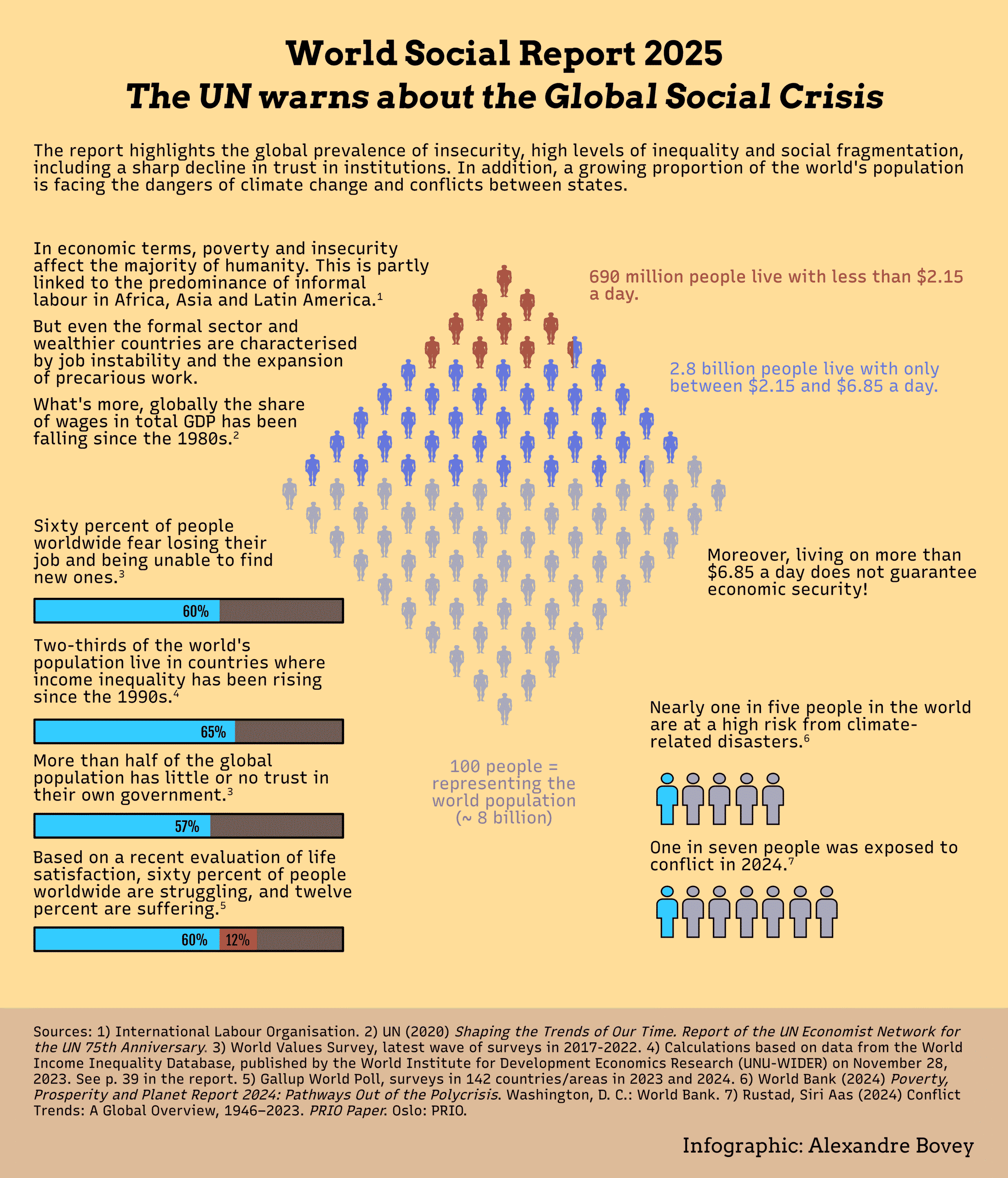
- UN World Social Report 2025
- Other Charts & Visualizations
- Football
Projects
Food Waste


Media Concentration

Football Match Reports/Dashboards

The Death Toll of the Global Border Regime


Historical Incomes
I used the dataset about historical average incomes by region from the World inequality Database, to create various small multiple charts (shown below) as well as this interactive line chart made with D3 and Svelte.
UN World Social Report 2025
- Tableau Public page
- Behance page
Other Charts & Visualizations
Below I include a more general gallery of my visualizations, as well as exercises and tests I did when I was learning to use Python and R.

 2148 x 1280")
 02")


 02")


